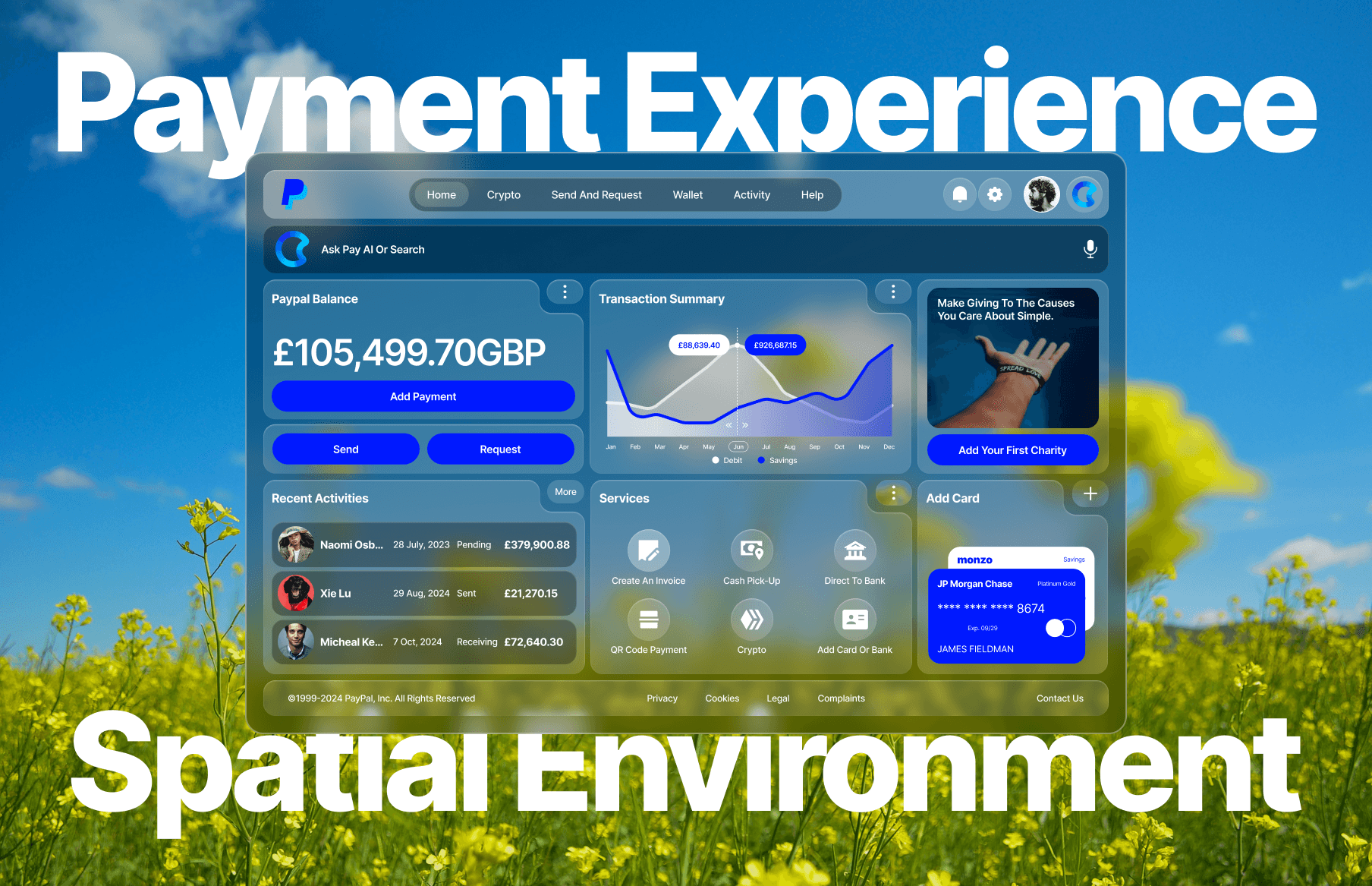
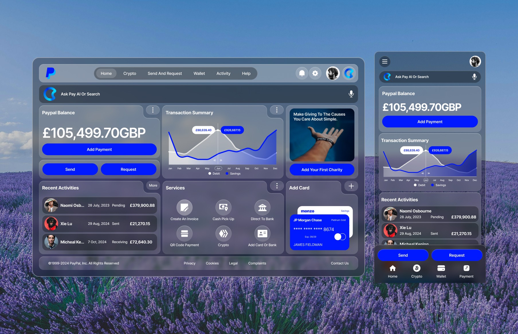
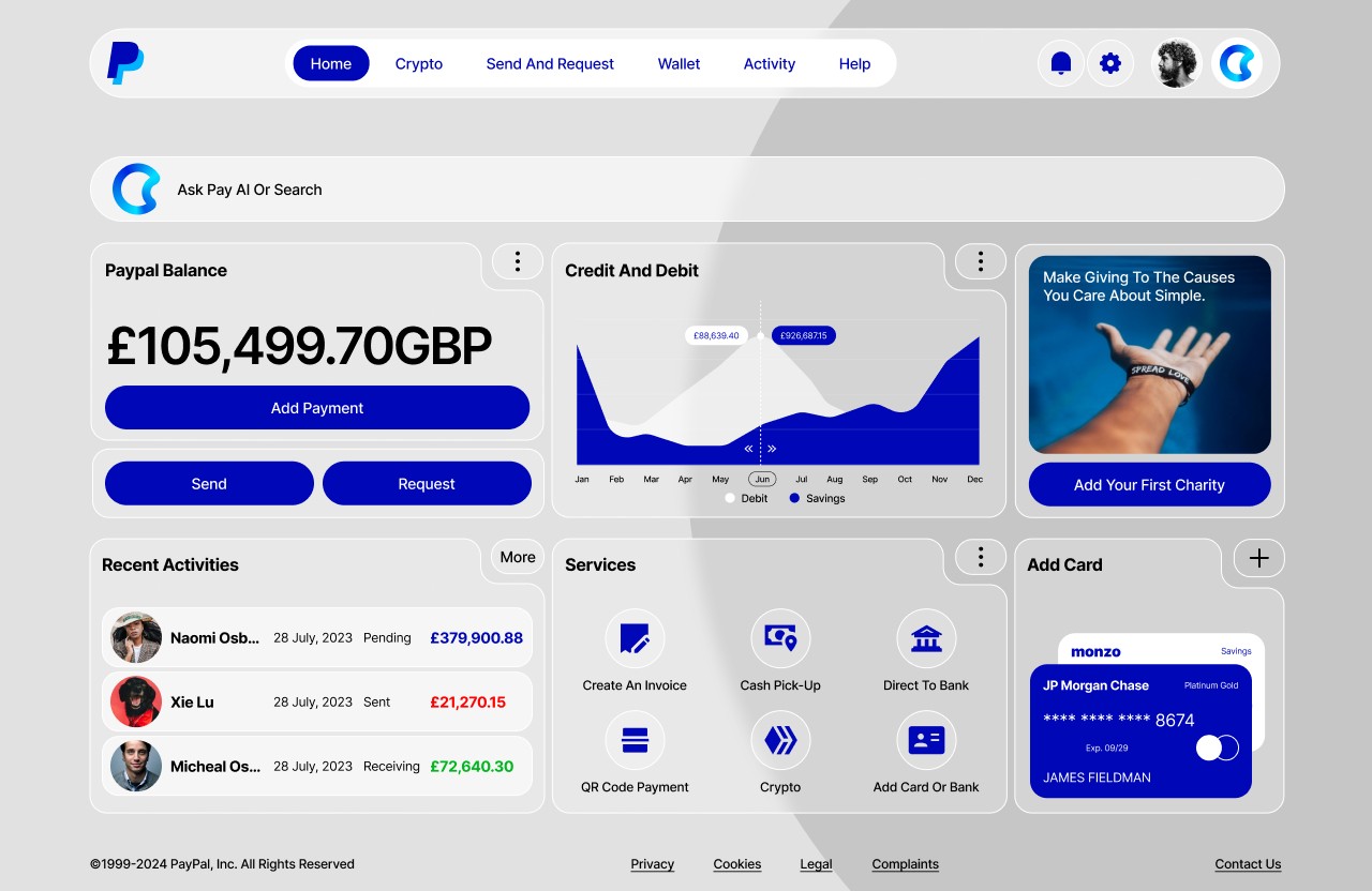
AR/VR Payment Dashboard
Atomic Design is a methodology that structures a UI using basic building blocks to ensure scalability and consistency. The PayPal rebrand case study demonstrates how combining this approach with spatial computing principles can create a cohesive and user-friendly interface, overcoming the common design challenge of balancing creativity with system-wide uniformity.
My Role
UI Designer — Reconfigure, Data Structure, Mockups, Interactive Design
Tools
Figma, Figjam, Final Cut Pro
Timeline
3 weeks
Overview
In the ever-evolving landscape of digital design, maintaining consistency while fostering creativity is a significant challenge. Enter Atomic Design — a methodology that breaks down UI components into fundamental building blocks, enabling scalable and maintainable design systems. This PayPalrebrand excercise serves as a compelling case study in leveraging Atomic Design and spatial computing principles to achieve a cohesive and user-friendly interface. This article explores the principles of Atomic Design and spatial computing and how PayPal can applied them to revitalize its user experience.
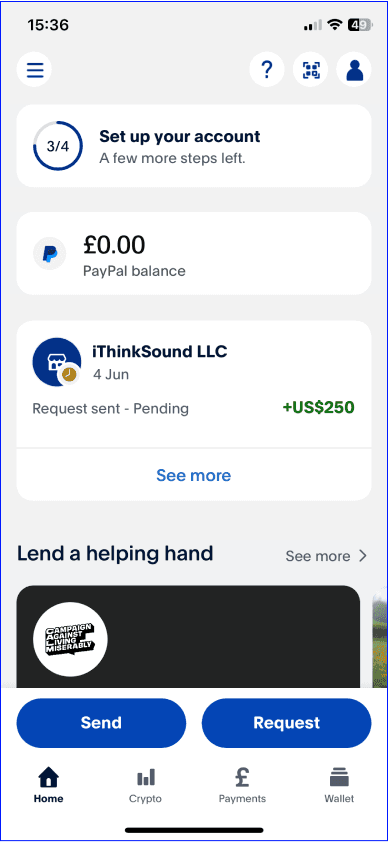
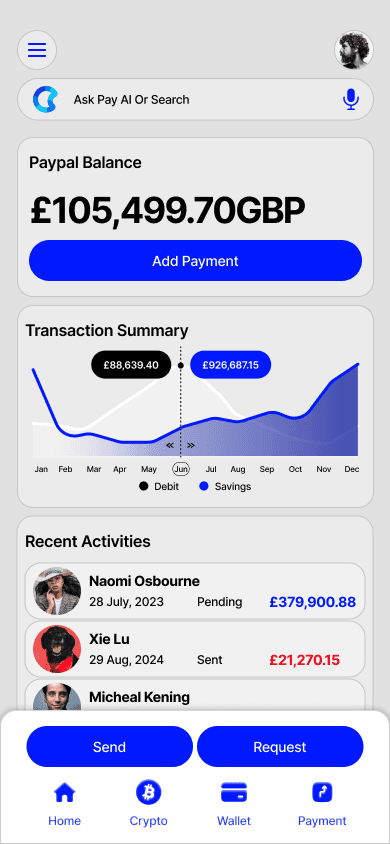
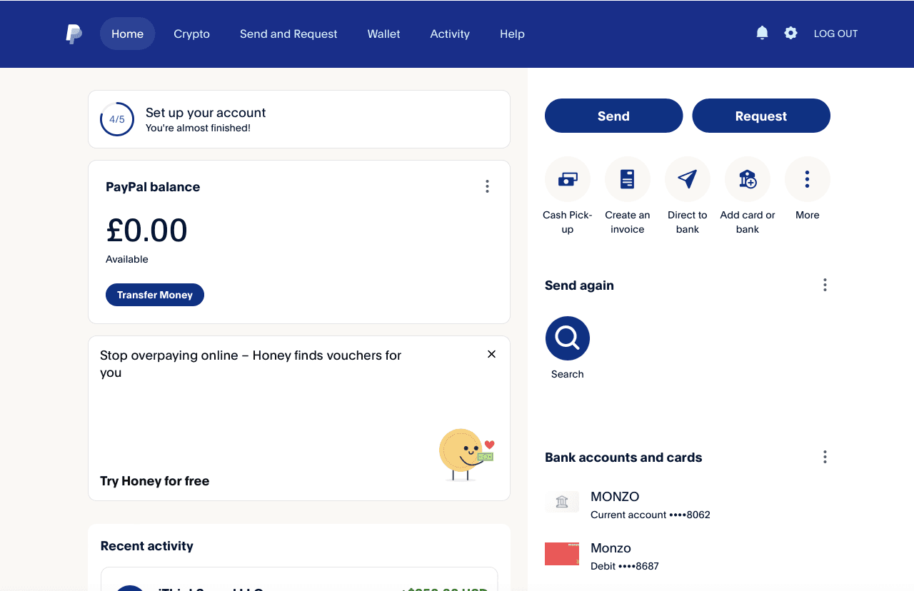
UI Redesign Exercise
As a global leader in online payments, PayPal required a UI that was not only visually appealing but also consistent, user-friendly, and scalable. The existing design had become outdated, with overused design styles and brand elements in dire need of a refresh. This update aimed to revitalise the visual interface and usability across both traditional digital devices, such as phones and laptops, as well as modern devices like VR sets and Apple’s Vision Pro. By adopting Atomic Design principles, I sought to create a cohesive design system that could be easily maintained and expanded across different device especially in a spatial environment.
Most importantly, I aimed to elevate user interactions by leveraging the principles of spatial computing, which offer more immersive and intuitive experiences. This involved rethinking how users navigate and interact with PayPal’s services in 3D environments, ensuring that the design was both functional and engaging on emerging platforms. The integration of spatial computing principles allowed PayPal to create a futuristic interface that not only met current user needs but also anticipated future technological advancements.
By focusing on these innovative design approaches, PayPal’s UI rebrand aimed to deliver a cutting-edge user experience that is adaptable, forward-thinking, and aligned with the evolving digital landscape.
Atomic Design
Atomic Design is a methodology created by Brad Frost that draws inspiration from chemistry. It breaks down UI into five hierarchical levels:
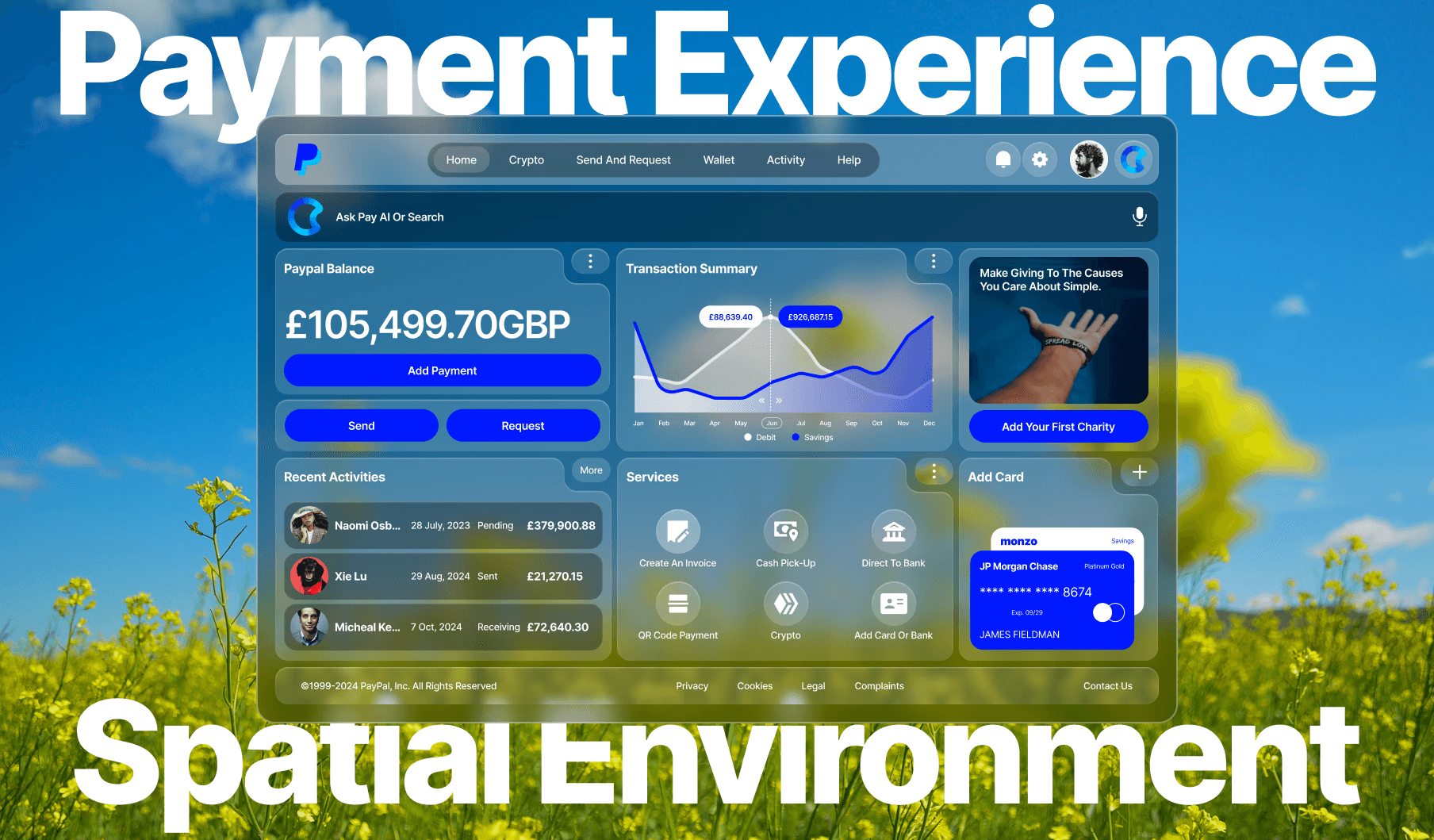
Atoms: Atoms are the foundational elements of the design system. They include:
Typography: Standardized font styles and sizes for headings, paragraphs, and text elements.
Forms: Visual design of a shapes as a fill or stroke element.
Colours: Defined colour palette ensuring brand consistency.
Spacing: Standardized units of measurement for margins, padding, and layout.
Images/Videos: Visual representation of a scene or subject captured in a two-dimensional format. A video is a sequence of images displayed in rapid succession to create the illusion of motion.
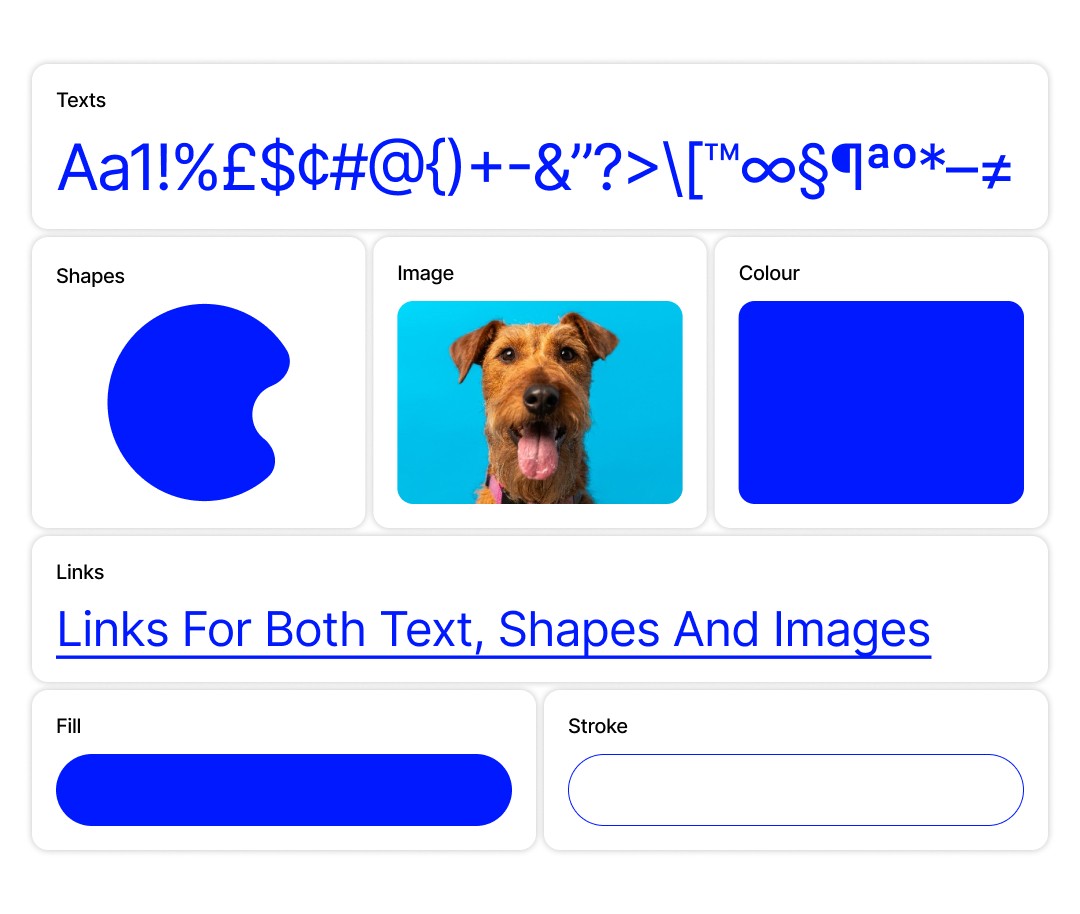
Molecules: Molecules are formed by combining atoms. They represent simple UI components:
Texts Field: Allows users to input and edit text data.
Button: Combination of forms to create a Collections of buttons used together, such as “Request” and “Send”.
Container: Basic containers combining text, images, and buttons for information display.
Organisms:
Organisms are more complex structures built from molecules and atoms:
Navigation Bars: Combining the logo, search input, and menu items.
Header Sections: Including a title, subtitle, and action buttons.
Listings: Grouping multiple cards into a list or grid layout.
Search Bar: Design element that allow users to enter a query or keywords to search for specific information.
Graphs: Visual representation of data designed to show relationships between different sets of information.
Templates
Templates provide the overall structure and layout of a page, without the final content.
Pages
Pages are the final product, where templates are filled with real content.
This approach promotes a systematic and scalable design process, making it easier to maintain consistency across a product.
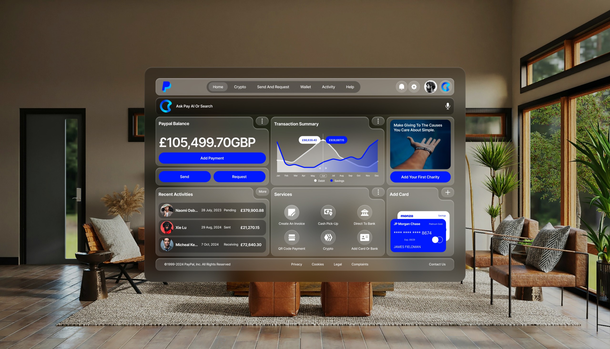
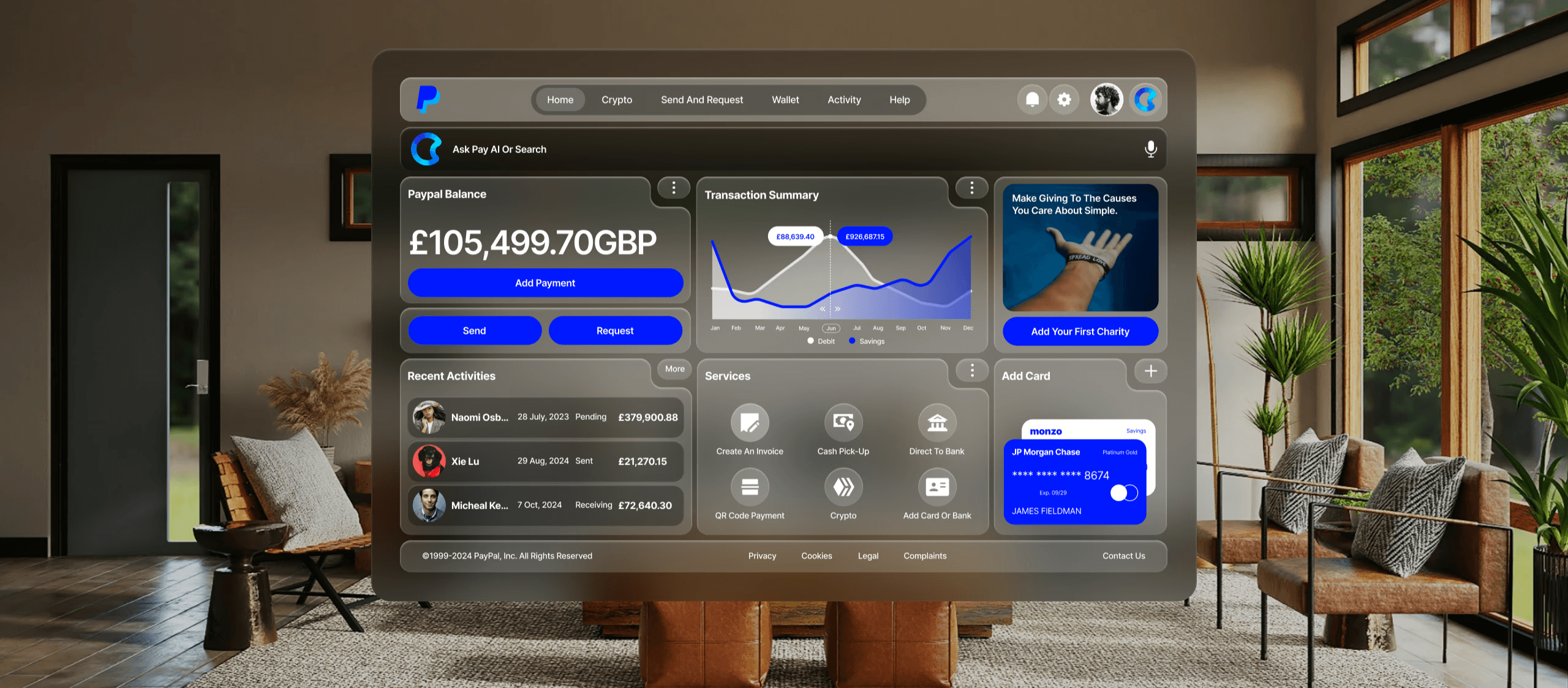
Spatial User Interfaces
Spatial computing effectively blends the physical and digital worlds through augmented reality (AR), virtual reality (VR), and mixed reality (MR). In developing the PayPal app, I aimed to establish a visual language that maintains consistency and familiarity within this spatial context, while allowing specific elements to interact dynamically with immersive experiences.
As we enter the age of spatial computing, creating intuitive and engaging user interfaces are essential. Here are the key UI foundations applied during the redesign.
Three Dimensional App Icons:
To enhance user familiarity, app icons are transformed into three-dimensional elements. When engaged, these icons expand, supported by specular highlights and shadows that contribute to a sense of depth. Effective icon creation involves using multiple layers, I used a base layer plus up to two transparent foreground layers, all sized at 1024x1024 pixels. This layered approach, coupled with circular cropping, ensures that graphics remain centered and visually appealing, avoiding off-center issues when icons expand.
Adaptive Glass Material:
The introduction of a glass material offers a versatile UI component that adapts to varying lighting conditions, whether in bright daylight or dim environments. This material not only integrates seamlessly into the physical world but also enhances the spatial experience by allowing surrounding light and colors to show through. I would encourage to minimize opaque elements, as the glass’s dynamic nature ensures that the interface remains light and unobtrusive, facilitating user interaction in any setting.
Optimized Typography for Legibility:
Typography is crucial for ensuring clear communication in a spatial environment. By using semantic font styles consistent across platforms, legibility is enhanced, especially at varying distances. I adjusted the font weight to medium for body text and bold for titles to enhance contrast against vibrant materials. Additionally, I increased the tracking for better readability, while introducing new font styles that allow for varied layouts, making the text more engaging and accessible. This thoughtful approach to typography ensures that users can easily read and interact with the content, no matter their viewing distance.
Dynamic Vibrancy Effect:
Vibrancy significantly enhances legibility by dynamically adjusting foreground content as background conditions change. This feature brightens text and symbols by drawing light and color from underlying layers, ensuring clarity. I tried to use proper use of vibrancy not only for enhancing legibility but also to reinforce visual hierarchy through primary, secondary, and tertiary text styles. For optimal visibility, I employed using white text against colourful backgrounds is recommended.
Use of Colour:
Colour plays a vital role in UI design, influencing both aesthetics and functionality. I encourage designers to consider system-calibrated colours that adapt dynamically to ensure consistent legibility across various backgrounds. Using vibrant colours thoughtfully can help in creating a visually appealing interface while maintaining clarity. Transparent or less saturated colours can enhance depth without overwhelming the user, ensuring a harmonious balance between form and function.
By implementing these principles — layered icons, adaptive materials, optimized typography, dynamic vibrancy, and thoughtful color use — designers can create applications that are not only visually appealing but also intuitive and user-friendly. As spatial computing continues to evolve, embracing these design strategies will be essential in delivering engaging and immersive user experiences that resonate with users in a three-dimensional landscape.
Integrating these principles into UI design can significantly enhance user experience by making interactions more intuitive and engaging.
Challenges and Lessons Learned
Adoption
Ensuring team-wide adoption of the design system is challenging. It required extensive training and documentation to get all designers and developers on board.
Maintenance
A design system is a living document that requires ongoing maintenance. I dedicated resources to regularly update the system, ensuring it evolved with new design trends and user needs.
Flexibility
While Atomic Design emphasizes consistency, it also needed to allow for creativity. I balanced standardization with flexibility, enabling teams to innovate while staying within the guidelines.
Cultural Shift
Implementing Atomic Design required a cultural shift within the organization. I had to embrace a new way of thinking about design and development, moving from a fragmented approach to a cohesive, system-based methodology.
Continuous Improvement
Atomic Design is not a one-time project but an ongoing process. I committed to continuous improvement, regularly revisiting and refining the design system based on feedback.
Conclusion
The UI rebrand using Atomic Design and spatial computing principles demonstrates the power of this methodology in creating scalable, consistent, and user-friendly interfaces. By breaking down the UI into fundamental building blocks and integrating immersive, context-aware elements, this rebrand excercise achieves a cohesive design system that not only enhanced the user experience but also streamlines design and development processes. As digital products continue to grow in complexity, Atomic Design and spatial computing offer robust frameworks for maintaining order and fostering innovation.
The lessons learned from this experience highlight the importance of a well-defined design system, ongoing maintenance, and the need for a cultural shift towards a more systematic approach to design. As more companies adopt Atomic Design and spatial computing principles, the potential for creating more efficient, scalable, and user-centric digital experiences becomes increasingly achievable.
