From Frustration to Conversion: A User-Centered Mobile Ticketing
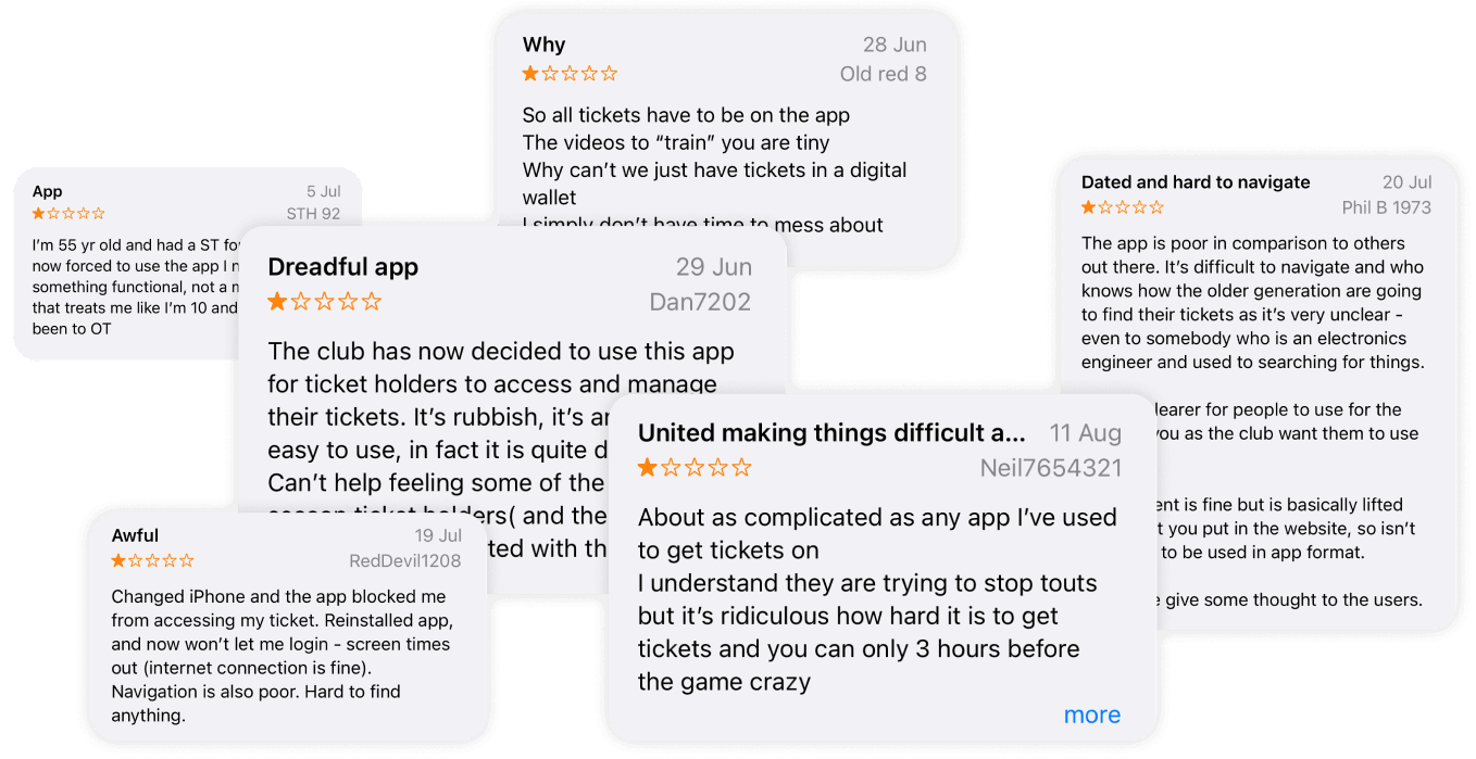
Manchester United official app serves over 85 million. However, the ticketing functionality has proven to be challenging to access and process by its users. This has resulted in low review ratings, increased user frustration, and a decline in retention rates.


My Role
UX Research, Design Thinking, Wireframing, Interaction Design, Prototyping
Tools
Figma, Figjam, Final Cut Pro
Timeline
2 months
Discover
Customers have found the ticketing feature difficult to access, and the checkout process has been overly complicated, leading to a frustrating user experience.
Design Challenge
Redesigned Manchester United’s ticket platform to help fans find and purchase tickets more easily—prioritizing clear ticket visibility and a faster, friction‑free checkout.
Process
Discover
Secondary Research
User Research
Affinity Mapping
Competitors Analysis
Identifying Problems
Define
Persona
Experience Mapping
Task Flow
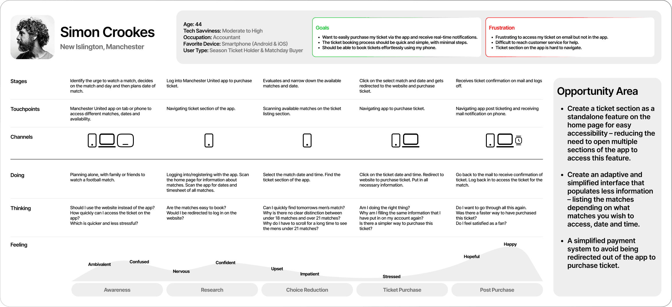
Opportunity Area
Develop
Sketching
Mid Fidelity
User Testing
Deliver
High Fidelity
Prototyping
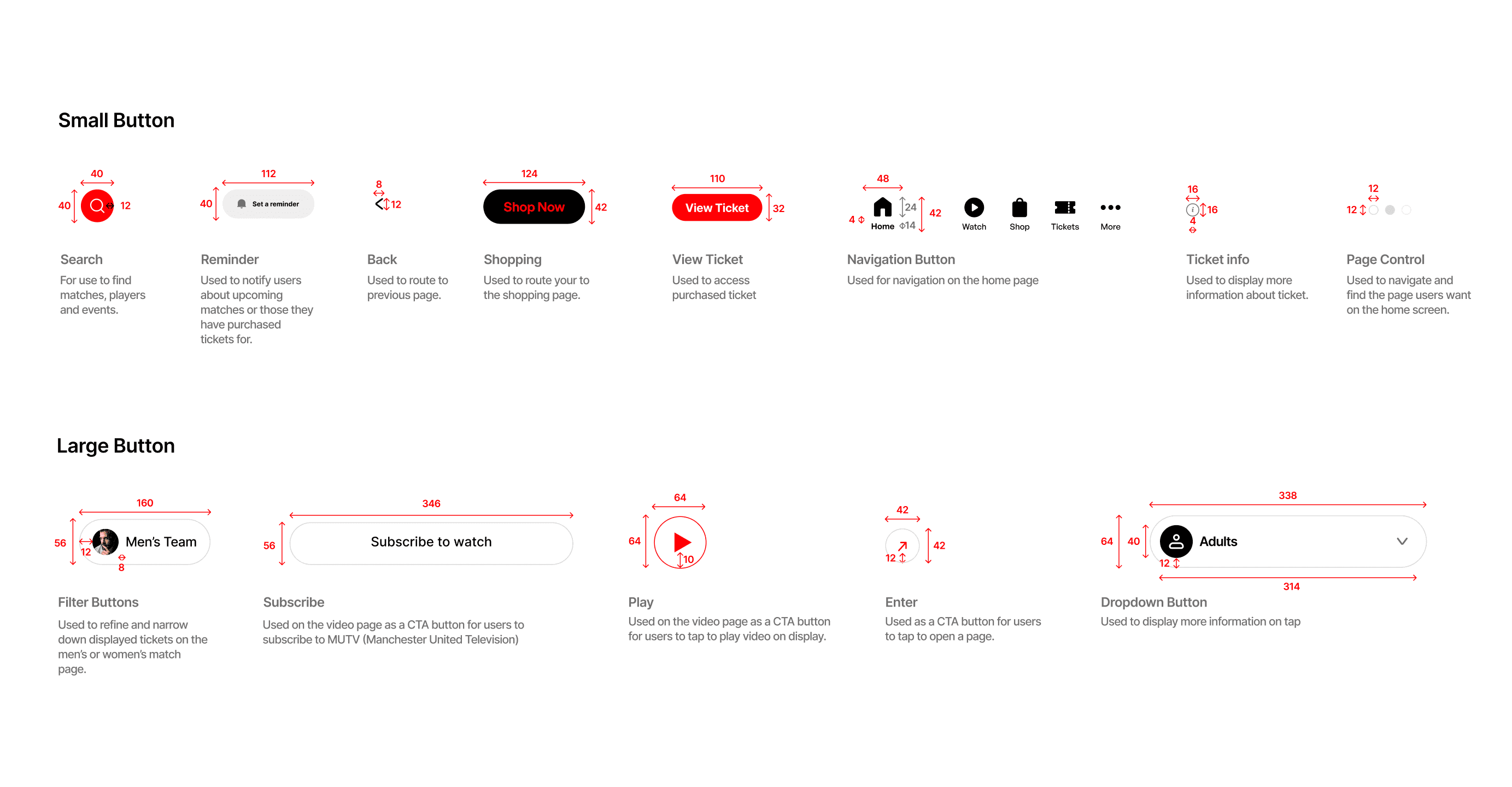
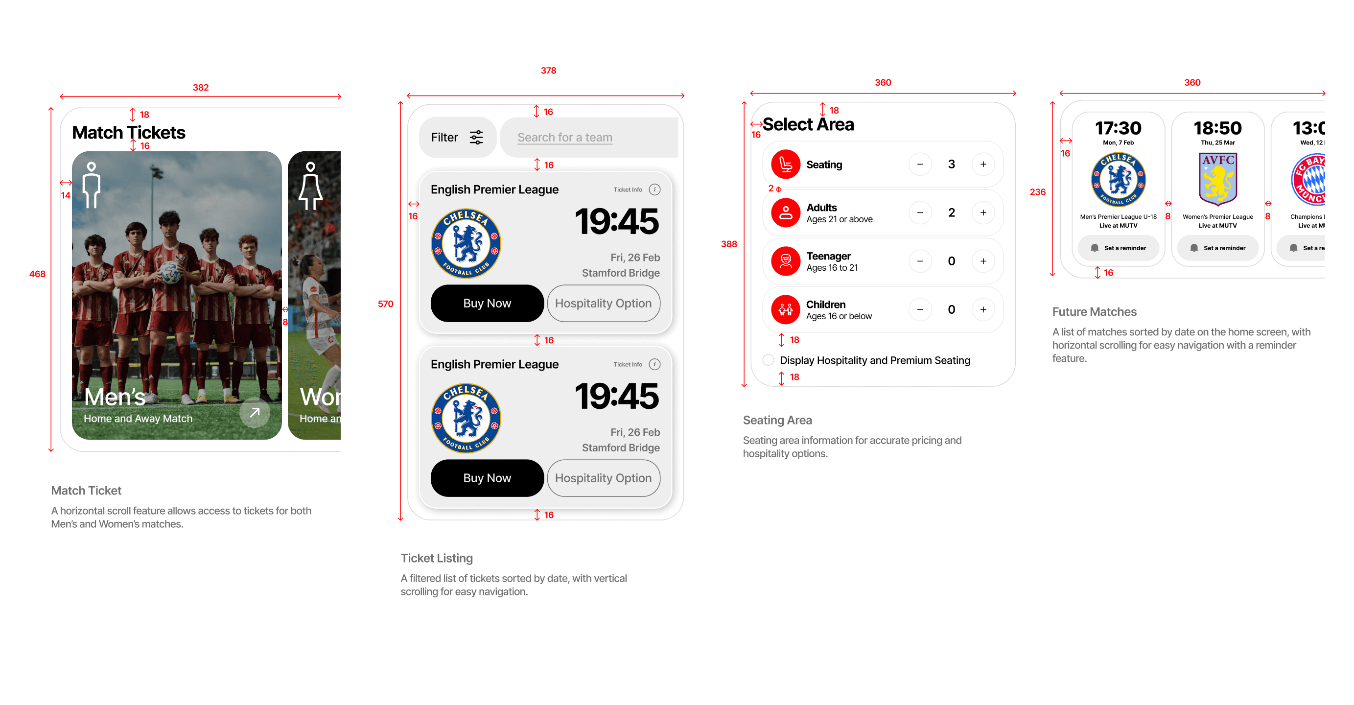
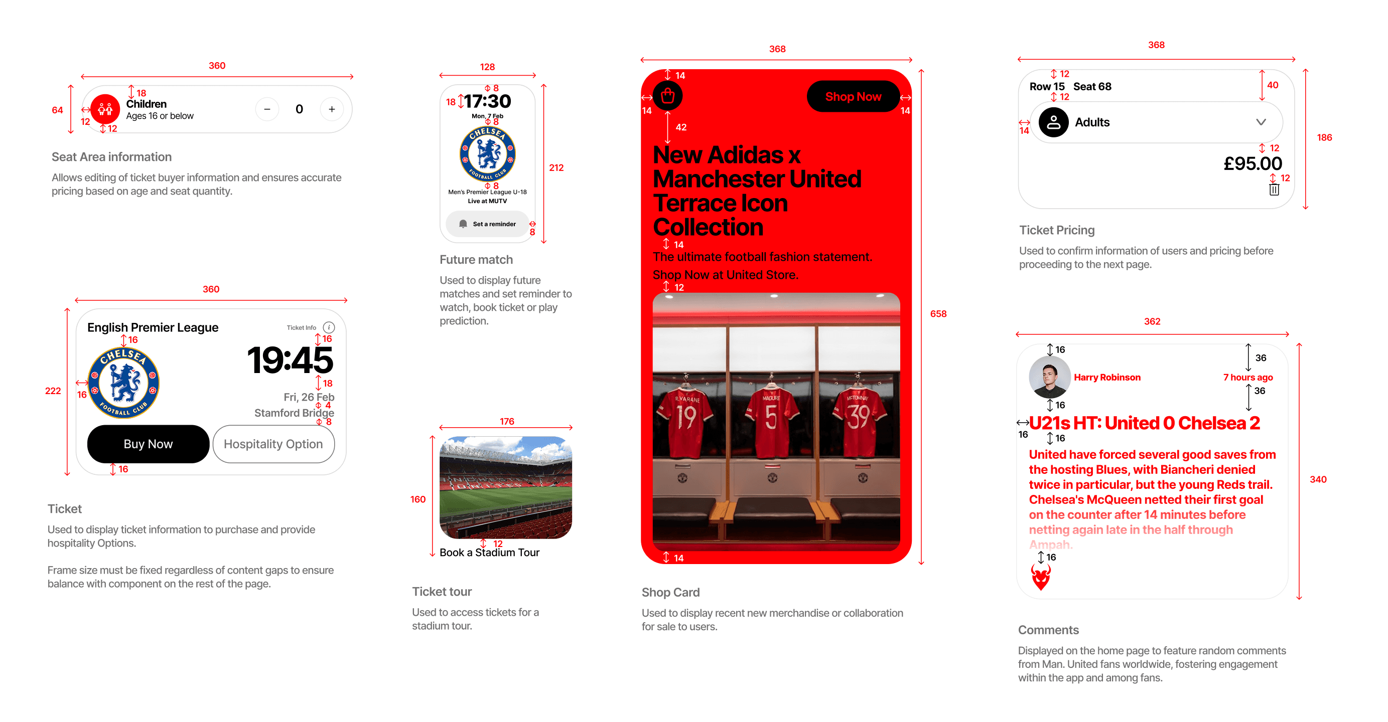
UI Library
Evaluations
Secondary Research
An inaccessible ticketing feature in football club apps can lead to several significant drawbacks:
Reduced Fan Engagement:
Football club apps with poorly accessible ticketing features can see a 20-30% decline in active user engagement, as fans become frustrated and turn to third-party platforms for ticket purchases.
Missed Revenue Opportunities:
Clubs risk losing substantial revenue from ticket sales due to abandonment. A report from Deloitte states that 56% of users abandon online purchases if the process is cumbersome, impacting matchday revenue.
Negative User Feedback:
Apps with navigation issues often experience lower app store ratings, with research showing that apps rated below 4.0 are downloaded 50% less frequently. Negative feedback can deter new users from downloading or engaging.
Decline in Retention Rates:
Accessibility issues contribute to a 15-25% drop in retention rates within three months, as fans stop using the app due to frustration, leading to decreased brand loyalty and a fragmented user base.
User Research
During the design exercise, extensive user feedback was leveraged from reviews on the club’s official app store. Over 57 reviews were analyzed to guide user research. This data was categorized into three key themes: user behaviours, goals, and pain points, providing valuable insights for the redesign process.
Affinity Mapping
Behaviour
Goal
Pain Point
Easy Access to Ticket Section
“So now that the club have started sending your tickets to your App instead of email. I can't access my tickets, I've already deleted and reinstalled so l has no idea what could be wrong.”
“I hope I can be able to sort my ticket using the app and get real time notification on my app and my mail after purchasing a ticket.”
“It is frustrating that I cannot access my ticket on my app but I can on my mail.”
Simplifying Ticket Listing
“I have been unable to carry out the ticketing tasks and have emailed the club a number of times requesting assistance I have not received a response.”
“I want to be able to get a ticket with very few steps and not have to go through so much to get one.”
“I get worried that I can’t access customer service to help with this especially when it is so complicated.”
Navigating for Phone Use
"It's difficult to navigate as the content is fine but is basically lifted from what you put in the website, so isn't designed to be used in app format."
“I want to be able to use my phone to my phone to easily book my tickets."
"It is cumbersome to navigate on the ticket section on the phone app."
Competitive Analysis
To improve the ticketing experience, I compared competitor apps to identify what competitors were successful at and what we could improve on.
It is important to acknowledge that user opinions and preferences may vary depending on their individual experiences with each product.

Chelsea
Key features that stand out from other competitors; easy and comprehensive interface, comprehensive ticketing options giving users a variety of options with little clicks as possible.
Pros
Comprehensive Ticketing: Offers a wide range of ticket options, making match selection easy.
User-Friendly Interface: The explore page is designed for easy use, especially for beginners and users over 50.
Cons
Hidden Ticket Section: Tickets are only found in the explore tab, making them less visible.

Barcelona
Key features that stand out from other competitors; easy and comprehensive interface, comprehensive ticketing options giving users a variety of options with little clicks as possible.
Pros
Integrated Ticket: The homepage prominently features ticket options.
Friendly User Interface: Tickets are organized by date for a user-friendly experience.
Cons
Unorganized Tickets: No clear categories; all match types are mixed together.
Manchester United’s app offers ticket access and organized categories like its competitors. Following an analysis, opportunities have been identified to enhance these features in the redesign.
Define
Persona
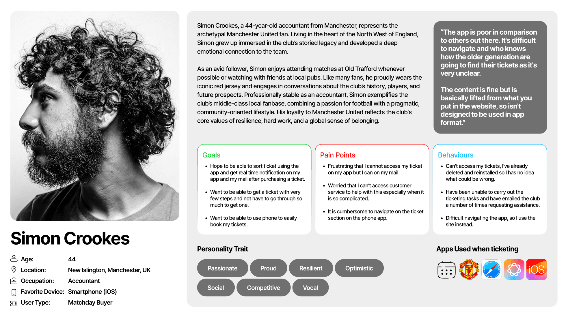
To further illustrate the ideal user based on user research, I incorporated insights from, users interview, competitive analysis and the review section of the app on iOS and playstore. I aimed to represent the user’s goal, behaviour and frustrations.
Experience Mapping
The experience map pinpointed specific parts for design adjustment, enabling me to explore solutions that could address the How Might We inquiries for users such as Simon Crookes.
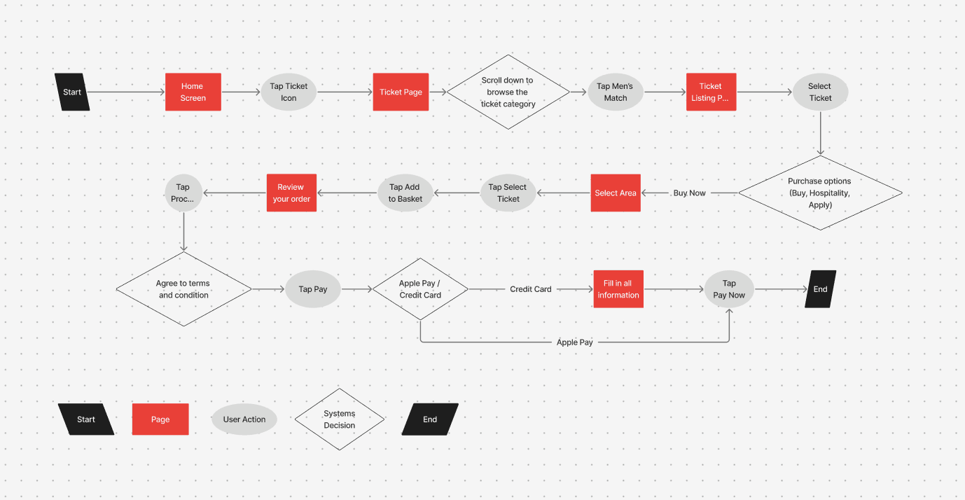
Task Flow
Old Task Flow - Complex task flow using the app and website.
The task flow assumes that our user, Simon has already set up an account with the app and has been a frequent ticket buyer.
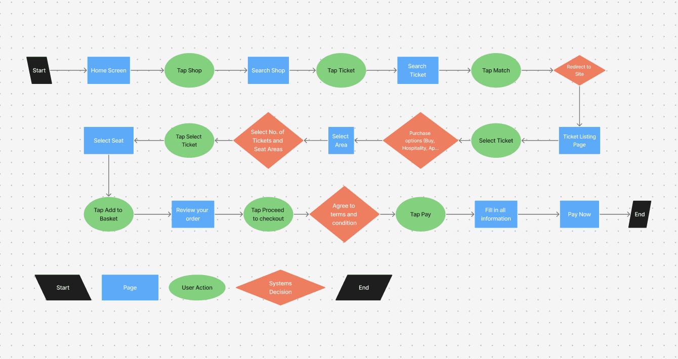
New Task Flow - Eliminating the use of website and streamlining task flow.
The task flow assumes that our user, Simon has already set up an account with the app and has been a frequent ticket buyer.
Opportunity Area
Prominent ticketing feature
The first solution prioritizes quick ticket access by featuring the ticketing function prominently on the app’s homepage. This minimizes the steps required to complete a purchase, allowing users to buy tickets in as few clicks as possible.
Adapting interface based on categories
The solution ensures users can easily browse and filter available match categories, with clear displays of essential details—such as teams, date, and time—to support quick and confident booking decisions.
Simplified Checking Out Process
To accelerate checkout, there would need to be an integration of one-click digital wallet payments like Apple Pay/Google Pay, to create a faster and seamless purchasing experience.
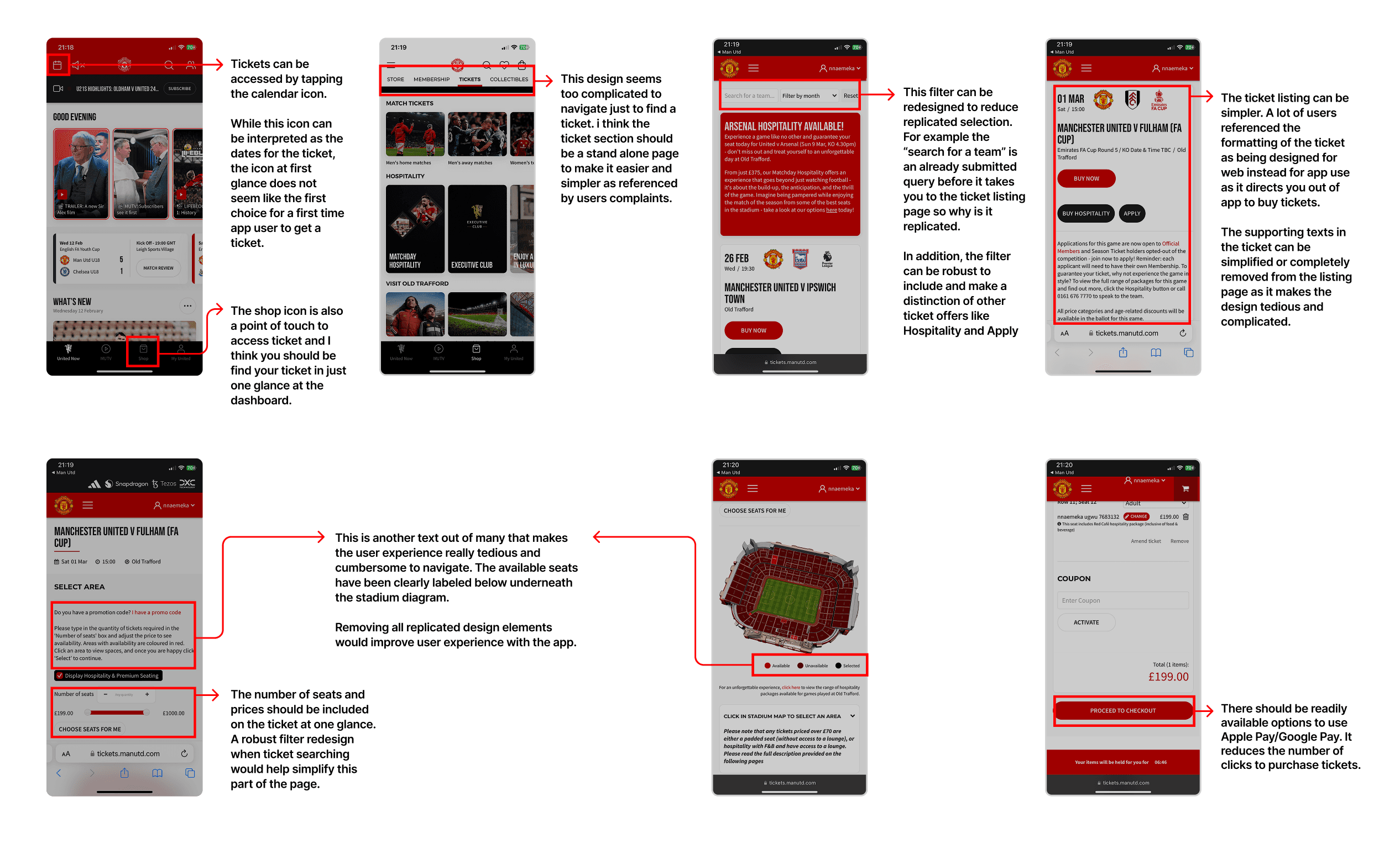
Identifying Problems
I constructed a graphical representation of the current design versions that can be enhanced based on research and consumer input. This served as the groundwork for the app's overhaul.
Develop
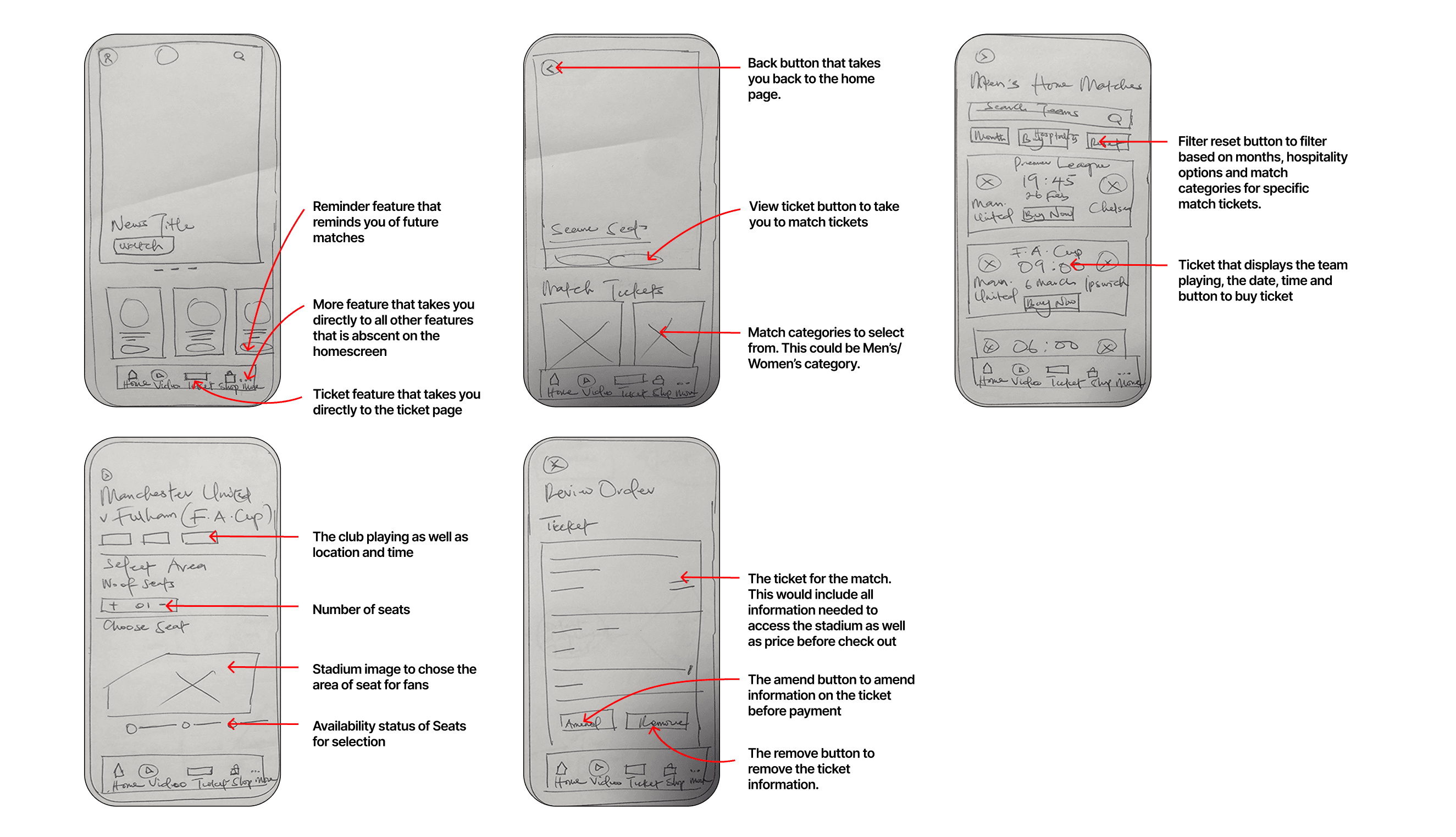
Sketches Solution
Following the creation of the flow chart, I proceeded to quickly sketch low-fidelity wireframes as a preliminary step to strategize improvements and determine how enhancements can be implemented.
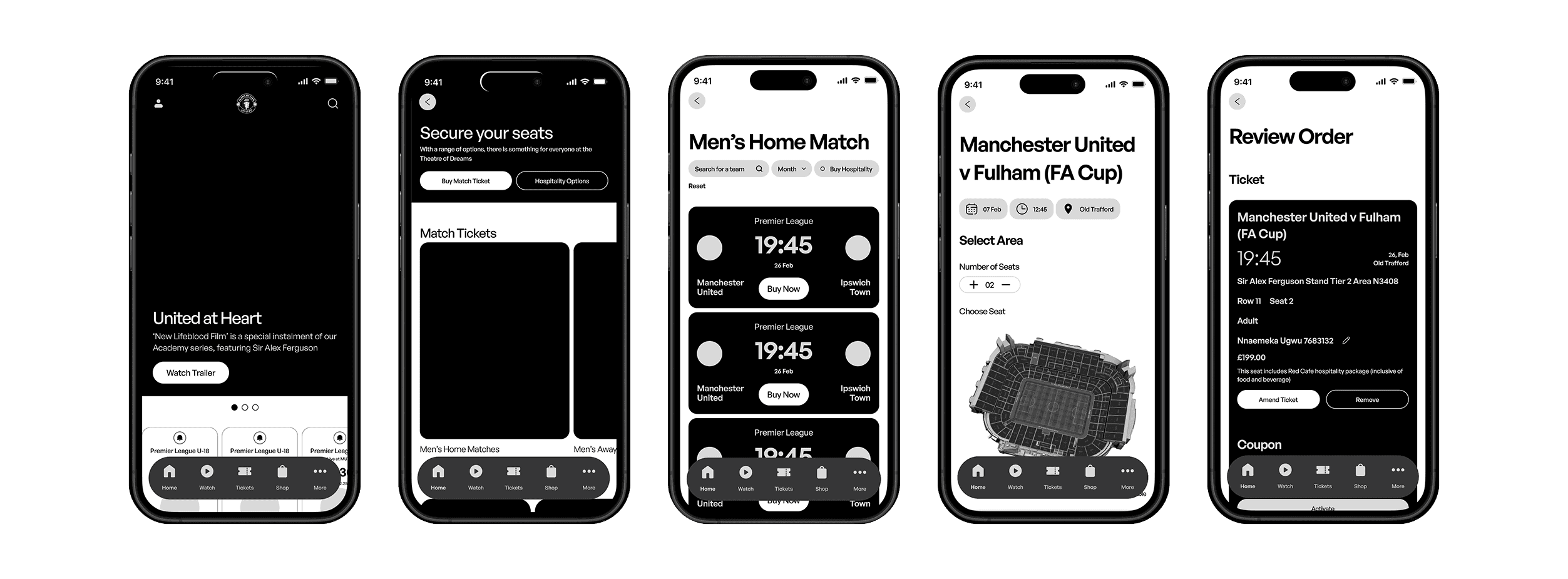
Mid-Fidelity
After generating low-fidelity sketches, I transitioned to Figma to create the structural design within a phone frame, aiming to visualize how it would fit on a mobile and making necessary size adjustments.
Key User Testing Findings
Undertaking 2 phases of user analysis with 10 participants enabled me to compile insights and refine the design based on evidence and details collected during testing. This helped me pinpoint oversights and make enhancements that weren't initially considered.
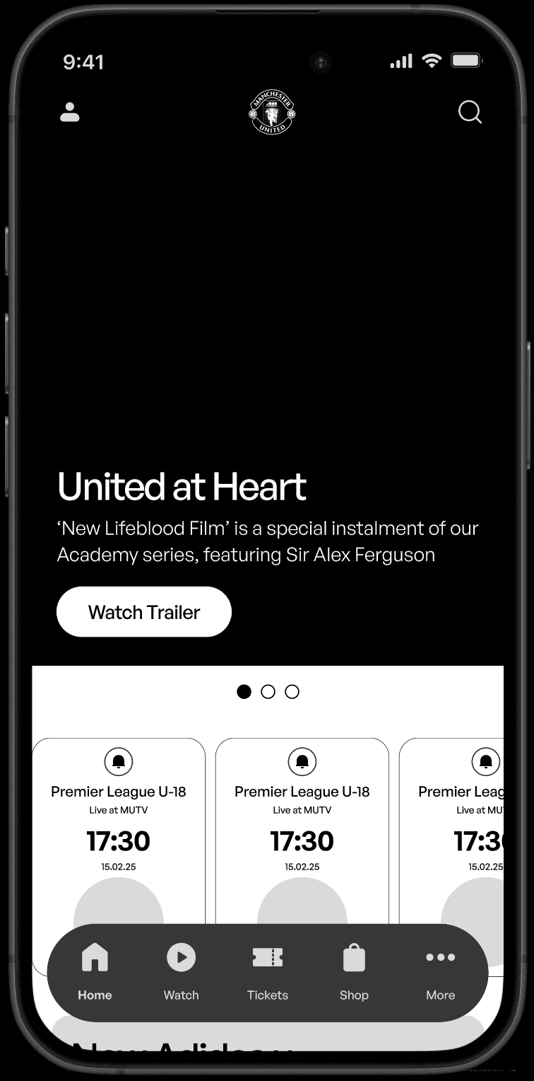
Unresponsive Button
Due to small dimensions, users indicated interaction difficulties. Users also recommended additional explanations about the button's interactive nature, especially for those dealing with dyslexia.
Before
After
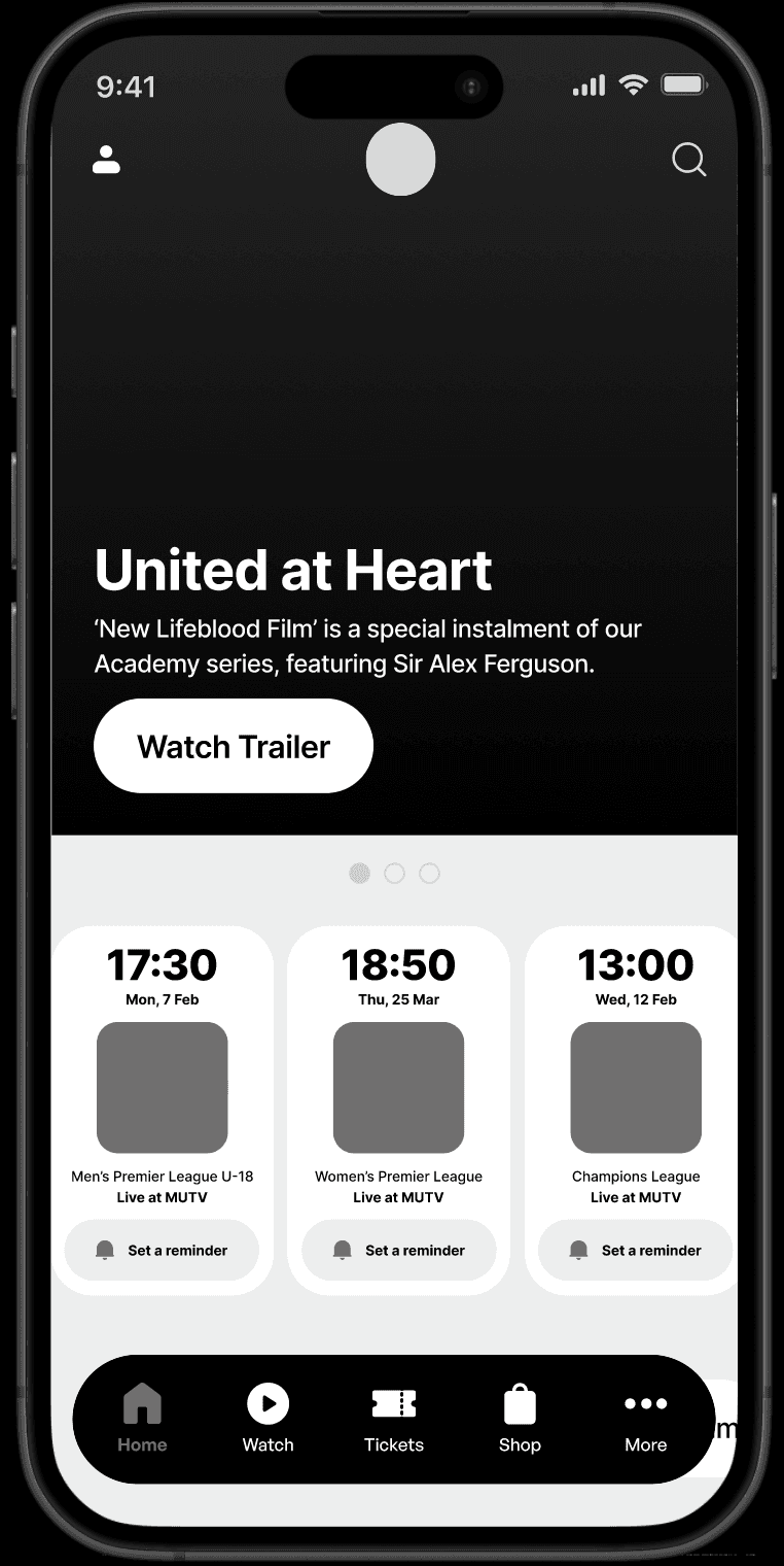
Accessible & Interactive CTA Button
The button was redesigned with accessibility in mind. The button's padding was increased to help with interaction and we added descriptive text to help dyslexic users know what it does.
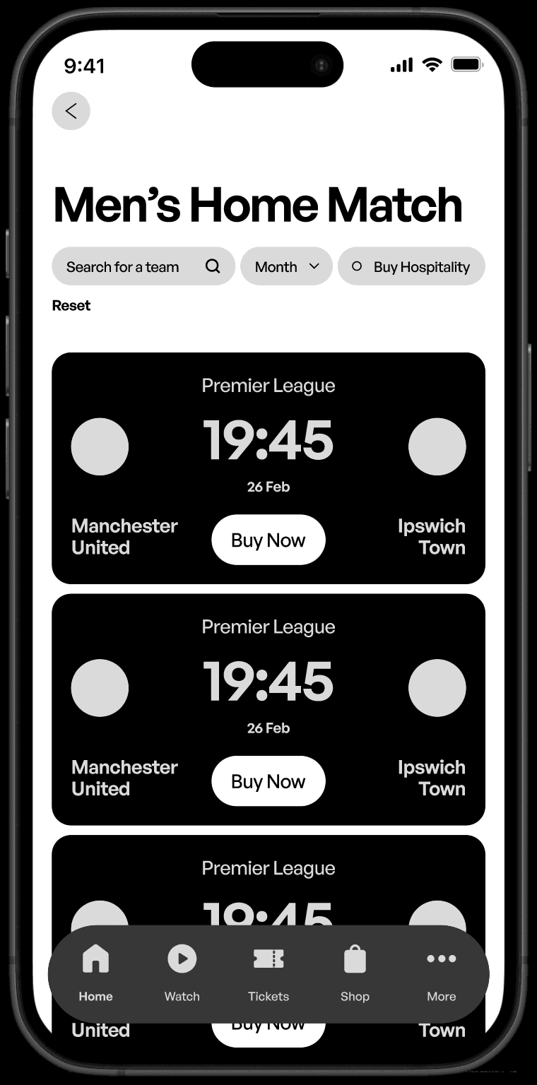
Unavailable Venue & Hospitality Choices Information
Users raised concerns about the removal of hospitality options from the previous designs and also the lack of match address on tickets.
Before
After
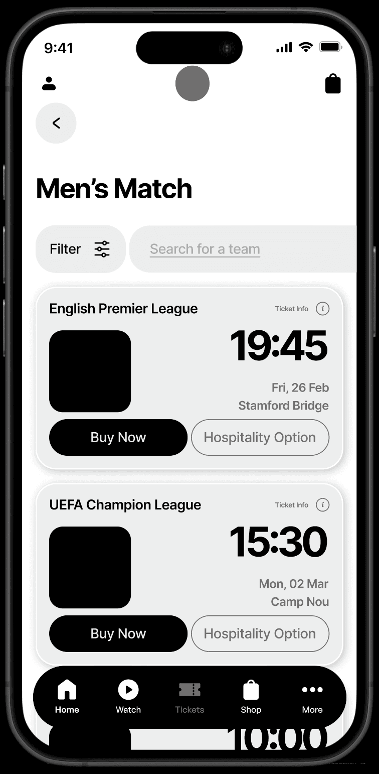
Robust Filter & Improved Ticket Design.
The filter is redesigned to enhance user experience by allowing efficient data sorting, quick access to relevant ticket, and improved navigation. The ticket is also redesigned to provide hospitality options for fans.
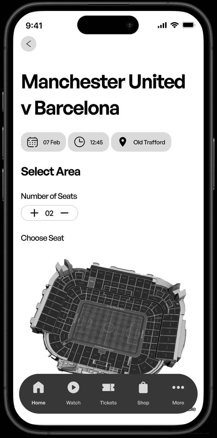
Limited Seat Area Filter
During the evaluation phase, a conflict arose among users desiring to shift the remaining ticket options, namely Adult, Teenager, Children, to the select area field of the ticket page.
Before
After
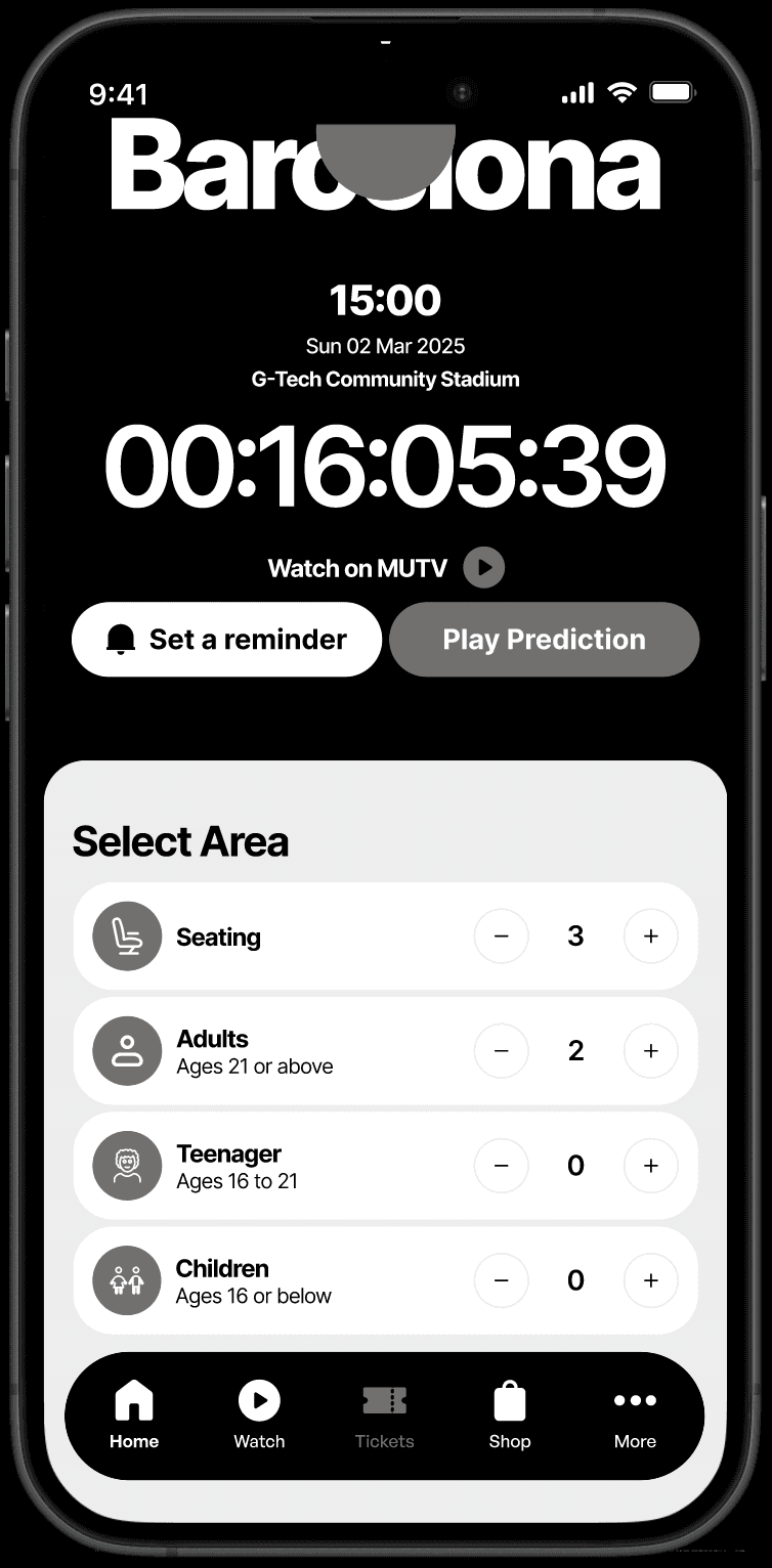
Improved Selection Interface
The ticket selection area now incorporates filters that were initially found on the ticket options tab. It was redesigned to ease navigation.
Deliver
High Fidelity
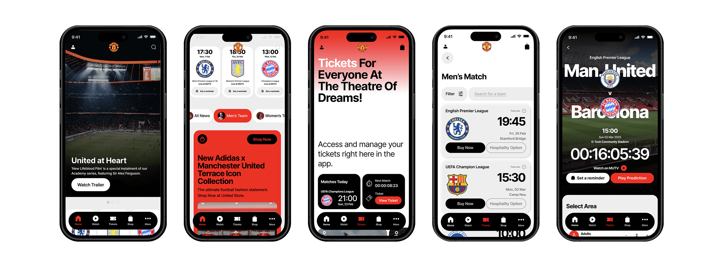
I designed the high-fidelity prototype with accessibility in mind, following WCAG guidelines to ensure usability for people with diverse disabilities, including visual, auditory, physical, cognitive, and neurological impairments. Additionally, I prioritized responsiveness, accessibility, and UI best practices.
Prototype

Onscreen ticket notification
Gives users quick access to timely, high-value ticket information they can understand at a glance.

Onscreen ticket notification
Gives users quick access to timely, high-value ticket information they can understand at a glance.
Easy access to ticket and reminder features
Get access to your favourite matches easily with the ticket features on the home screen.
Set reminders on future matches right on your Home Screen


Support service
Access match tickets, stadium tour visits, support service and ticketing information directly on your ticket page.
Enhanced filtering system
Obtain tickets for Under-18, Under-21, home, and away games through our vigorous filtering system for streamlined ticket categorization and corresponding match passes.


Improved check out experience
Get the ideal seat for you at the perfect cost by modifying ticket details and seat location.
UI Library
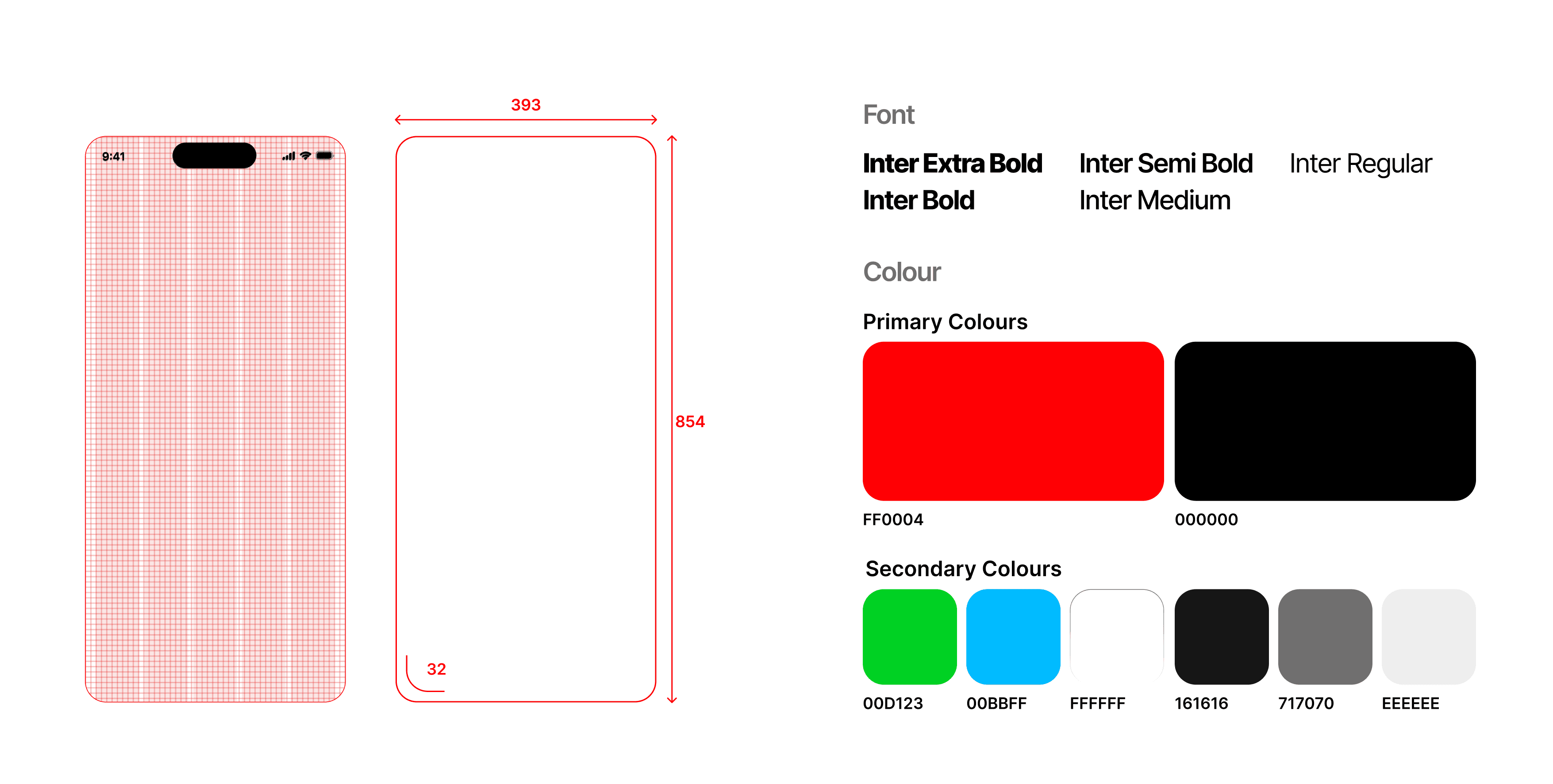
In order to refine our current model or transition seamlessly to our development team, I've assembled a UI library. This library includes Foundations (shades, typefaces, layouts), along with Atoms, Molecules, and Organisms.
Evaluation
To assess this prototype, we carried out a remote, self-guided task-centered usability study involving 10 participants from a mix of users across different demography. A qualitative survey ensued, prompting participants to detail their thinking process during the task performance.
Here is a succinct summary of our methodology:
Explain the concept behind the redesign to the users.
Ask them to perform benchmark task one by one.
Prompt for feedback after each task regarding what went well and what did not.
Iterate designs based on new insights
Participants were able to navigate through the benchmark tasks effortlessly, and the survey provided a platform to gather qualitative user thought data during app use.
Results
60%
Increase in ticket visibility on the homepage, making it easier for users to find.
40%
Reduction in the number of steps required to complete a ticket purchase task.
Reflection
From the very beginning of the project, the human-centered design process proved necessary to not only maximise positive ticketing experience. User testing became one of the most invaluable UX processes within this project to ensure that the solution aligned with the problem space. Though conflicting user feedback made wireframing iterations a challenging phase.
While evaluating the designs throughout the project, we always pushed to get a varied sample for testing. This helped in making sure that our solution wasn't targeting just one demographics, but could instead help improve ticketing experience for every users across different demographics.
